I’ve been following the debate concerning the CBS memos because I believe it has a lot to teach about the future of media, authority, journalism and blogging. It is also a fascinating story in its own right. In any case, there are worse places to start reading about the beginning of the controversy than ABC News’ The Note (The Note: Sep. 10, 2004). Of course, the most recent Washington Post (reg. req.) article on the issues will get you up to speed quicker (Expert Cited by CBS Says He Didn’t Authenticate Papers). See also, Seth Finkelstein (CBS (60 Minutes) Forged Memos Comparison Evidence and More concerning story that 60 Minutes documents on Bush may be fake).
In any case, despite mounting evidence that the memos are unlikely to have been created in the early 1970s, CBS News continues to defend the story vigorously, if not very successfully. For example, last evening’s defense of the CBS memos is, once again, quite problematic. On September 13th, the CBS Evening News included a report where they introduced two new experts who claim to find that the memos are consistent with memos of the early 1970s. One of these new experts is a software designer who claims that the documents use a lower case “L” in place of a numeric one. From the transcript:
DAN RATHER: Richard Katz, a software designer found other indications in the documents. He noticed the lower case “L” is used in documents instead of the actual numeral one. That would be difficult to reproduce on the computer today.RICHARD KATZ (Software Designer): If you were doing this a week ago or a month ago on a normal laser jet printer, it wouldn’t work. The font wouldn’t be available to you.
This brief exchange isn’t quite clear, but I think what Katz is getting at is that many typewriters of the era “cheated” by having people use a lowercase “L” in place of a numeric one. There was no key for a numeric one on many typewriters of the day. Katz claims that a numeric one isn’t being used in the documents, but a lower case “L” is. This would be evidence that the documents were written on a typewriter. At least, I think that is what the argument is.
However, it is not only wrong, it actually contradicts the claim that the documents were typewritten on a proportionally spaced typewriter. Why? Glad you asked.
First, I have no idea how Katz can claim to distinguish between a numeric one and a lowercase “L” on these documents. They look exceedingly similar to me. Given the degradation of the copies CBS has deigned to let us see, how can Katz be so sure?
For example, let’s take a look at lowercase “L” and numeric one in Microsoft Word’s Times New Roman. I’ve provided examples in both 48pt type and 12pt type:
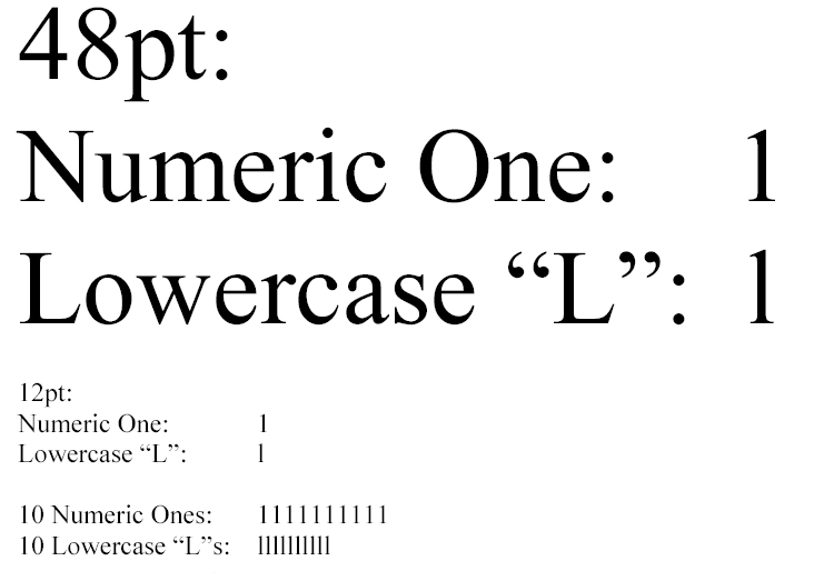 |
There are subtle differences between the shapes of the two characters, but I doubt highly that one could easily distinguish them in 12pt type on a poor copy. The most important distinction between the two characters is their spacing. The numeric one has space on either side so that it is the same size as other numbers (in other words, all the numbers are monospaced). This makes numbers line up in nice columns. The lowercase “L” on the other hand, is proportionally spaced so that it is quite narrow. The difference in spacing is subtle but can be seen in the documents provided.
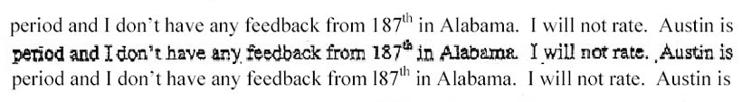
To see the distinction, consider this line (which was highlighted in the CBS Evening News report) from one of the CBS memos (Bush National Guard Memo August 18, 1973 [PDF]). I’ve extracted the line that was partially highlighted in the report. The comparison text is 12pt Times New Roman from Microsoft Word. The text has been reduced in size to 96% of the original in order to match the CBS memos.
The first line is Microsoft Word text using both numeric one and lowercase “l” as appropriate. It matches quite nicely with the memo’s text, which is on the second line. The third line is what happens when you use lowercase “L” as numeric one in “l87”. The difference is quite clear:
 |
In this second example, the first and second lines are the same. In the third line, I’ve used lowercase “L” followed by a space such as “l_87”. The difference is more subtle but it is still rather clear, given the degradation of memo CBS has allowed to be made public:

Finally, another comparison from the typed letterhead of one of the other memos (Bush National Guard Memo May 4, 1972 [PDF]). The first line is what happens when you use all lowercase “L”s. Clearly, that is not what happened. The second line uses numeric ones, the third is from the memo, and the fourth is lowercase “L” with spaces between letters. Althought the difference is quite subtle, to my eye the numeric one is a closer match:From the above two examples I conclude that it is most likely that the device which produced these documents had both a numeric one and lowercase “L” and that the typist actually used them as appropriate, in general.

Of course, if proportionate spacing typewriters had both “1”s and “l”s, why would the typist only use lowercase “L”? After all, the typist of the memos was clever enough to insert a superscript special character (the infamous “th”) and do some really nice center aligning. Why wouldn’t the typist have used both numeric one and lowercase “L”?However, this image is really to make another point. The reason many typewriters “cheated” in not having a numeric one and only had a lowercase “L” was because they were monotype. The shape of the characters was extremely similar, and in monospaced type the spacing was identical. So, it made sense to have a cheat. However, in proportionate spaced type, lowercase “L” and numeric one have very distinct spacing and lowercase “L”s look odd in many cases when used as “ones.” And, if you were typing some columns of numbers, the use of proportionately spaced lowercase “L” would really mess up the alignment. Thus, though I am no expert, I would imagine that most proportionate spaced typewriters would have distinct characters for numeric one and lowercase “L”. Of course, one might argue that the typewriter used for these memos, although proportionately spaced, did not have separate characters for numeric one and lowercase “L”. I consider that improbable, but if there is evidence that proportionate spaced typewriters continued to leave out numeric ones, I would be interested in seeing it.
Thus, I conclude and assert that Katz really doesn’t know what he is talking about and his defense of the authenticity of the memos is really quite weak.
Btw, this is a tentative conclusion. I’m no expert and the documents provided by CBS are quite poor quality though they claim, according to the Mercury News (reg. req.), that they have first-generation copies (CBS stands by story on Bush’s service, defends memos’ authenticity):
CBS spokeswoman Sandy Genelius said Monday that the network possesses what it believes to be so-called first generation copies duplicated directly from the original documents.But the copies posted on its Web site are somewhat blurred and speckled, suggesting repeated copying.
Genelius said she could not explain why the versions posted on the CBS Web site appear to have been repeatedly copied, while the copies the network relied on for its reporting were not.
Sure would be nice if CBS would make high quality scans of the documents available. Might help CBS’ case.
Nevertheless, I believe my demonstration here casts serious doubt on Katz’s claim.
UPDATE 0930 Pacific Time
More detailed “1” vs. “l” analysis by Joseph Newcomer here: The Bush “Guard memos” are forgeries!.
Scroll down to “Additional Update 13-Sep-04 – The L with it!”